Code
library(tidyverse)
library(ggplot2)
library(gapminder)
library(ggpubr)
library(ggthemr)
library(tidyverse)
library(ggplot2)
library(gapminder)
library(ggpubr)
library(ggthemr)data001=gapminder
head(data001)# A tibble: 6 × 6
country continent year lifeExp pop gdpPercap
<fct> <fct> <int> <dbl> <int> <dbl>
1 Afghanistan Asia 1952 28.8 8425333 779.
2 Afghanistan Asia 1957 30.3 9240934 821.
3 Afghanistan Asia 1962 32.0 10267083 853.
4 Afghanistan Asia 1967 34.0 11537966 836.
5 Afghanistan Asia 1972 36.1 13079460 740.
6 Afghanistan Asia 1977 38.4 14880372 786.data002= data001 %>% filter(year==1997)ggplot(data,aex(x=,y=,color=))+geom_xxxx()
ggplot(data002, aes(lifeExp, gdpPercap, colour = continent)) +
  geom_point()
data002= data001 %>% group_by(continent,year) %>% summarise(pop=sum(pop))ggplot(data002, aes(year, pop, colour = continent)) +
geom_line()+ scale_y_continuous(labels = scales::label_number_si())
data002= data001 %>% filter(year==1997) %>% group_by(continent) %>% summarise(pop=sum(pop))ggplot(data002, aes(x=continent, y=pop)) +
geom_bar(stat="identity")+scale_y_continuous(labels = scales::comma)
data002= data001 %>% filter(year==1997,continent=='Asia')ggplot(data002, aes(gdpPercap)) +
geom_histogram()
multiple histogram
data002= data001 %>% filter(year==1997)
ggplot(data002, aes(gdpPercap,fill=continent,colour=continent)) +
  geom_histogram(alpha = 0.5, position = "identity")
data002= data001 %>% filter(year==1997)ggplot(data002, aes(x=continent, y=gdpPercap)) +
geom_boxplot()
data002 %>% filter(continent=='Americas') %>% arrange(desc(gdpPercap)) %>% head()# A tibble: 6 × 6
country continent year lifeExp pop gdpPercap
<fct> <fct> <int> <dbl> <int> <dbl>
1 United States Americas 1997 76.8 272911760 35767.
2 Canada Americas 1997 78.6 30305843 28955.
3 Puerto Rico Americas 1997 74.9 3759430 16999.
4 Argentina Americas 1997 73.3 36203463 10967.
5 Venezuela Americas 1997 72.1 22374398 10165.
6 Chile Americas 1997 75.8 14599929 10118.ggplot(data002, aes(x=continent, y=gdpPercap)) +
geom_boxplot()+
labs(title = "gdpPercap", subtitle = "by continent",caption = "*Data from gapminder")
ggplot(data002, aes(x=continent, y=gdpPercap)) +
geom_boxplot()+
labs(title = "gdpPercap", subtitle = "by continent",caption = "*Data from gapminder")+
theme(plot.title=element_text(hjust=0.5),plot.subtitle=element_text(hjust=0.5))
ggplot(data002, aes(x=continent, y=gdpPercap)) +
  geom_boxplot()+
  labs(title = "gdpPercap",  subtitle = "by continent",caption = "*Data from gapminder"
       , x ="each continent", y = "GDP Per cap")
ggplot(data002, aes(x=continent, y=gdpPercap)) +
  geom_boxplot()+
  labs(title = "gdpPercap",  subtitle = "by continent",caption = "*Data from gapminder"
       , x ="", y = "")
ggplot(data002, aes(x=continent, y=gdpPercap)) +
  geom_boxplot()+
  labs(title = "gdpPercap",  subtitle = "by continent",caption = "*Data from gapminder"
       , x ="", y = "")
ggsave("ggplot.png",width = 20, height = 20, units = "cm")准备数据
gapminder_data=gapminder
gapminder_data_cn_us_2007=gapminder_data %>%  filter(country %in% c('China','United States')) %>% filter(year==year)
gapminder_data_cn_2007=gapminder_data %>%  filter(country %in% c('China')) %>% filter(year==year)
gapminder_data_2007=gapminder_data %>% filter(year==2007)

gapminder_data_cn=gapminder_data %>%  filter(country %in% c('China')) %>% filter(year==year)
gapminder_data_us=gapminder_data %>%  filter(country %in% c('United States')) %>% filter(year==year)
gapminder_data_cn_us=gapminder_data %>% filter(country %in% c('China','United States')) %>% filter(year==year)# theme_bw
theme_bw=ggplot(data=gapminder_data_cn_us, aes(x=year, y=gdpPercap,color=country)) +
geom_line()+
geom_point()+
labs(
title = "theme_bw 主题",
subtitle = "1952年到2007年",
caption = "数据来源: Gapminder dataset",
)+
ylab("人均GPD")+
xlab("年")+
theme_bw()+
theme(text = element_text(family='Kai'))
# theme_classic
theme_classic=ggplot(data=gapminder_data_cn_us, aes(x=year, y=gdpPercap,color=country)) +
geom_line()+
geom_point()+
labs(
title = "theme_classic 主题",
subtitle = "1952年到2007年",
caption = "数据来源: Gapminder dataset",
)+
ylab("人均GPD")+
xlab("年")+
theme_classic()+
theme(text = element_text(family='Kai'))
# theme_dark
theme_dark=ggplot(data=gapminder_data_cn_us, aes(x=year, y=gdpPercap,color=country)) +
geom_line()+
geom_point()+
labs(
title = "theme_dark 主题",
subtitle = "1952年到2007年",
caption = "数据来源: Gapminder dataset",
)+
ylab("人均GPD")+
xlab("年")+
theme_dark()+
theme(text = element_text(family='Kai'))
# theme_void
theme_void=ggplot(data=gapminder_data_cn_us, aes(x=year, y=gdpPercap,color=country)) +
geom_line()+
geom_point()+
labs(
title = "theme_void 主题",
subtitle = "1952年到2007年",
caption = "数据来源: Gapminder dataset",
)+
ylab("人均GPD")+
xlab("年")+
theme_void()+
theme(text = element_text(family='Kai'))
ggarrange(theme_bw,theme_classic,theme_dark,theme_void)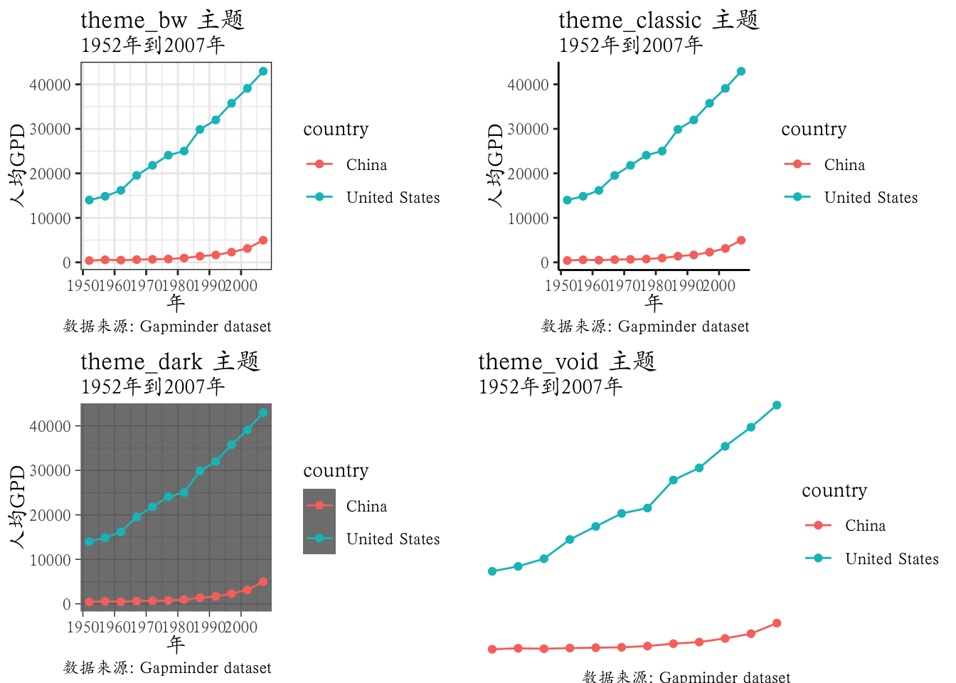
library(ggthemes)

#theme_base
theme_base=ggplot(data=gapminder_data_cn_us, aes(x=year, y=gdpPercap,color=country)) +
  geom_line()+
  geom_point()+
  labs(
    title = "theme_base 主题",
    subtitle = "1952年到2007年",
    caption = "数据来源: Gapminder dataset",
  )+
  ylab("人均GPD")+
  xlab("年")+
  theme_base()+
  theme(text = element_text(family='Kai'))

#theme_calc
theme_calc=ggplot(data=gapminder_data_cn_us, aes(x=year, y=gdpPercap,color=country)) +
  geom_line()+
  geom_point()+
  labs(
    title = "theme_calc 主题",
    subtitle = "1952年到2007年",
    caption = "数据来源: Gapminder dataset",
  )+
  ylab("人均GPD")+
  xlab("年")+
  theme_calc()+scale_fill_calc()+
  theme(text = element_text(family='Kai'))

# theme_economist
theme_economist=ggplot(data=gapminder_data_cn_us, aes(x=year, y=gdpPercap,color=country)) +
  geom_line()+
  geom_point()+
  labs(
    title = "theme_economist 主题",
    subtitle = "1952年到2007年",
    caption = "数据来源: Gapminder dataset",
  )+
  ylab("人均GPD")+
  xlab("年")+
  theme_economist()+scale_fill_economist()+
  theme(text = element_text(family='Kai'))

# theme_gdocs
theme_gdocs=ggplot(data=gapminder_data_cn_us, aes(x=year, y=gdpPercap,color=country)) +
  geom_line()+
  geom_point()+
  labs(
    title = "theme_gdocs 主题",
    subtitle = "1952年到2007年",
    caption = "数据来源: Gapminder dataset",
  )+
  ylab("人均GPD")+
  xlab("年")+
  theme_gdocs()+scale_fill_gdocs()+
  theme(text = element_text(family='Kai'))


ggarrange(theme_base,theme_calc,theme_economist,theme_gdocs)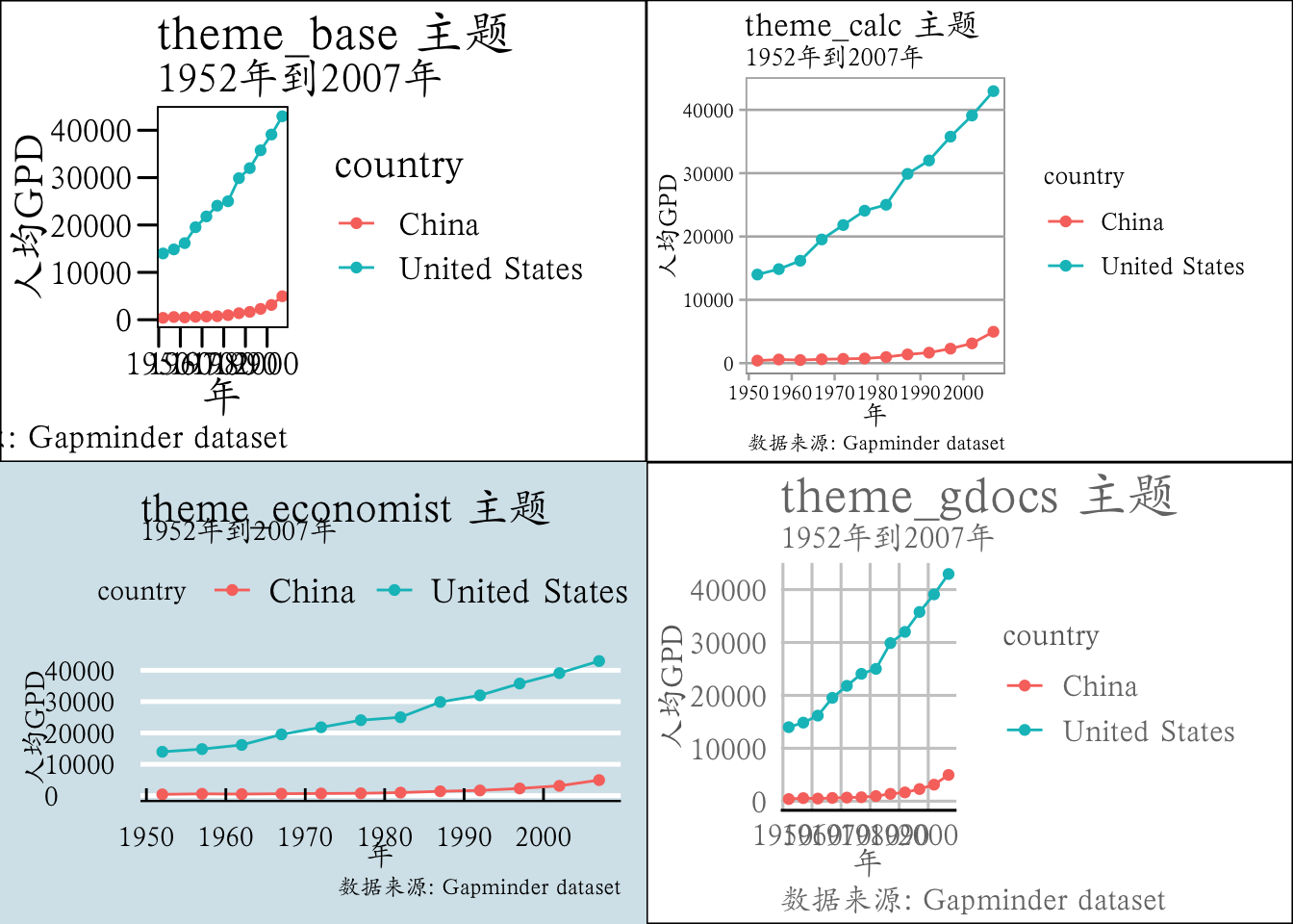
https://github.com/rstudio/cheatsheets/blob/main/data-visualization.pdf